
|
|

Headings
To create a header, place "hn. " at the start of the line (where n can be a number from 1-6).
| Notation |
Comment |
| h1. Biggest heading |
Biggest heading
|
| h2. Bigger heading |
Bigger heading
|
| h3. Big Heading |
Big Heading
|
| h4. Normal Heading |
Normal Heading
|
| h5. Small Heading |
Small Heading
|
| h6. Smallest Heading |
Smallest Heading
|
Text Effects
Text effects are used to change the formatting of words and sentences.
| Notation |
Comment |
| *strong* |
Makes text strong.
|
| _emphasis_ |
Makes text emphasis.
|
| ??citation?? |
Makes text in citation.
|
| -strikethrough- |
Makes text as strikethrough.
|
| +underlined+ |
Makes text as underlined.
|
| ^superscript^ |
Makes text in superscript.
|
| ~subscript~ |
Makes text in subscript.
|
| {{monspaced}} |
Makes text as code text.
|
| bq. Some block quoted text |
To make an entire paragraph into a block quotation, place "bq. " before it.
Example:
Some block quoted text
|
{quote}
here is quoteable
content to be quoted
{quote}
|
Quote a block of text thats longer than one paragraph.
Example: here is quoteable
content to be quoted
|
{color:red}
look ma, red text!
{color}
|
Changes the color of a block of text.
Example:
look ma, red text!
|
Text Breaks
Most of the time, explicit paragraph breaks are not required - Confluence will be able to paginate your paragraphs properly
| Notation |
Comment |
| (empty line) |
Produces a new paragraph |
| \\ |
Creates a line break. Not often needed, most of the time Confluence will guess new lines for you appropriately. |
| ---- |
creates a horizontal ruler |
| --- |
Produces — symbol. |
| -- |
Produces – symbol. |
Links
Links are the heart of Confluence, so learning how to create them quickly is important.
| Notation |
Comment |
[#anchor]
[^attachment.ext]
or
[pagetitle]
[pagetitle#anchor]
[pagetitle^attachment.ext]
or
[spacekey:pagetitle]
[spacekey:pagetitle#anchor]
[spacekey:pagetitle^attachment.ext]
|
Creates an internal hyperlink to the specified page in the desired space (or the current one if you dont specify any space). Appending the optional # sign followed by an anchor name will lead into a specific bookmarked point of the desired page. Also having the optional ^ followed by the name of an attachment will lead into a link to the attachment of the desired page.
Example:
pagetitle
If such a page doesnt already exist, it will allow you to create the page in the current space. Create page links will have a  after them. after them.
Example:
anewpage
|
[link alias|#anchor|link tip]
[link alias|^attachment.ext|link tip]
or
[link alias|pagetitle|link tip]
[link alias|pagetitle#anchor|link tip]
[link alias|pagetitle^attachment.ext|link tip]
or
[link alias|spacekey:pagetitle|link tip]
[link alias|spacekey:pagetitle#anchor|link tip]
[link alias|spacekey:pagetitle^attachment.ext|link tip]
|
Creates an internal hyperlink to the specified page in the desired space (or the current one if you dont specify any space) where the link text is different from the actual hyperlink link. Also you can have an optional link tip which will apear as tooltip. Appending the optional # sign followed by an anchor name will lead into a specific bookmarked point of the desired page. Also having the optional ^ followed by the name of an attachment will lead into a link to the attachment of the desired page.
Example:
link alias
|
|
[/2004/01/12/My Blog Post]
[spacekey:/2004/01/12/My Blog Post]
|
Creates an internal hyperlink to the specified blog post in the desired space (or the current one if you dont specify any space). You must specify the date the post was made in /year/month/day form as shown. Anchors and link text can be added the same way as described above. If you attempt to link to a blog post that doesnt exist, no link will be created.
Example:
|
[/2004/01/12]
[spacekey:/2004/01/12]
or
[my link name|/2004/01/12]
[my link name|spacekey:/2004/01/12]
|
Creates an internal hyperlink to a view of a whole days news. Specify the date you wish to link to as year/month/day. Link titles can be supplied as with other links. It is possible to link to days with no news items on them: the destination page will just be empty.
Examples:
|
[$12345]
or
[my link name|$12345]
|
Creates a link to a piece of content by its internal database ID. This is currently the only way to link to a mail message.
Examples:
|
[spacekey:]
[custom link title|spacekey:]
|
Creates a link to the space homepage, or space summary page of a particular space. Which of these the link points to depends on the configuration of the space being linked to. If the space does not exist, the link will be drawn with a strike-through to indicate it is an invalid space.
Examples:
|
[~username]
[custom link title|~username]
|
Creates a link to the user profile page of a particular user. By default, will be drawn with a user icon and the users full name, but if you supply a custom link text, the icon will not be drawn. If the user being linked to does not exist, the link will be drawn with a strike-through.
Examples:
|
[phrase@shortcut]
[custom link text|phrase@shortcut] |
Creates a shortcut link to the specified shortcut site. Shortcuts are configured by the site administrator. You can add a link title to shortcuts in the same manner as other links.
Examples:
|
[http://confluence.atlassian.com]
[Atlassian|http://atlassian.com] |
Creates a link to an external resource, special characters that come after the URL and are not part of it must be separated with a space. External links are denoted with an arrow icon.
Note: the [] around external links are optional in the case you do not want to use any alias for the link.
Examples:
|
| [mailto:legendaryservice@atlassian.com] |
Creates a link to an email address, complete with mail icon.
Example:
 legendaryservice@atlassian.com legendaryservice@atlassian.com
|
[file://c:/temp/foo.txt]
[file://z:/file/on/network/share.txt] |
This only works on Internet Explorer
Creates a link to file on your computer or on a network share that you have mapped to a drive
|
|
{anchor:anchorname}
|
Creates a bookmark anchor inside the page. You can then create links directly to that anchor. So the link [My Page#here] will link to wherever in "My Page" there is an {anchor:here} macro, and the link [#there] will link to wherever in the current page there is an {anchor:there} macro.
|
{redirect:Page Name}
{redirect:SPACE:Page Name|delay=10}
{redirect:http://www.somewhere.com/}
|
Redirects the browser to the specified page or URL.
Note: To allow editing of a page once it has been redirected,
add '?redirect=false' to the query string.
- [default] - (required) The page or URL to redirect to.
- delay - (optional) The number of seconds to delay before redirecting.
|
{alias:Alternate Name}
{alias:Alternate Name|parent=Another Page}
{alias:Alternate Name|parent=@parent}
|
Creates an alias for the current page. Any references to the alias will be redirected
to this page.
- [default] - The alias. Must follow standard page naming conventions.
- parent - (optional) The parent the alias should have. May be set to any page
in the current space. It will default to having no parent.
It may also be one of two special parent markers:
- @self - the parent will be the page being aliased.
- @parent - the parent will be the parent of the page being aliased.
|
|
{add-page:template=My Template|parent=Page Parent}Click to add page{add-page}
|
Generates an 'Add Page' link which, when clicked, can take the user directly
to a template and/or set the page parent.
- template - (optional) the name of the template to use when creating the page.
- boilerplate - (optional) the name of the template to use as a boilerplate when creating the page.
(requires the Scaffolding Macros to work correctly)
- parent - (optional) the name of the parent page (empty by default).
May also have the following markers:
- @self - the parent will be the page the macro is in.
- @parent - the parent will be the parent of the page the macro is in.
- @home - the parent will be home page for the Space the page is in.
- title - (optional) if you want popup text to appear when the mouse is hovered
over the link, enter it here.
|
{link-to:dashboard}Go to Dashboard{link-to}
{link-to:news|space=ANOTHERSPACEKEY}Go to another space's news{link-to}
{link-to:page source|popup=true}View page source{link-to}
|
Creates a link to special Confluence locations. All locations are non-case-sensitive.
Parameters
- [default] - The location to link to. See the list of locations below.
- space - (optional) The spacekey to link to.
- page - (optional) The name of the page to link to
- popup - (optional) If
'true', the link will open in a popup window.
- target - (optional) The name of the popup window to open.
- title - (optional) if you want popup text to appear when the mouse is hovered
over the link, enter it here.
Global Locations
- admin - The administration section.
- dashboard - The Dashboard.
- global templates - The global templates page.
- homepage - The user's homepage.
- login - The login page.
- logout - The logout page.
- notation guide - The notation guide.
- rss feed builder - The RSS Feed Builder (Confluence 2.x)
- spaces - The list of spaces the user has access to. (Confluence 1.4)
- user profile - The currently logged in user's profile.
- user history - The currently logged in user's history.
Space Locations
You can specify which space to link to by setting the 'space=key' parameter,
or it will default to the current space.
- add news - Add a news post.
- browse space - Go to the 'Browse Space' view.
- mail - The mail page.
- news - The news page.
- pages alphabetical - The list of pages in alphabetical order.
- pages tree - The hierarchical view of pages in the space.
- pages updated - The recently updated pages list.
- space attachments - The attachments list for the space.
- space templates - The space templates list.
- popular labels - A page listing popular page labels in the space. (Confluence 2.x)
- all labels - A page listing all labels across the space. (Confluence 2.x)
RSS Feeds
Again, you can specify the space, or the current one will be used as the default.
- rss comments - New comments are added to this feed.
- rss news - News items for the space are added to the feed.
- rss new pages - Any new pages in the space are added to the feed.
- rss updated pages - Any updated pages in the space are added to the feed.
Page Locations
You can specify the space key as above, and you can specify the page with the 'page=Page Name'
parameter.
- @parent - Links to the page's parent, if it has one.
- @self - Links to the page the macro is on.
- add comment - Opens the 'add comment' section of the page.
- page comments - Jumps to the page comments.
- page attachments - The attachments tab for the page.
- page children - Jumps to the page children list.
- page edit - The edit tab for the page.
- page history - The page history view.
- page info - The page info view.
- page source - The page source view
- pdf export - Export the page to PDF.
- print - The print view for the page.
|
{link-page:template=My Template|parent=Page Parent}Click to add page{link-page}
{link-page:Page Title|template=My Template}A Specific Page{link-page}
|
Links to a page in the current space.
If the page doesn't exist or is untitled, it generates a 'Add Page' link which, when clicked, can take the user directly
to a template and/or set the page parent.
- [default]/name - (optional) the title of the page. If not supplied, clicking the link will always create a new page.
- template - (optional) the name of the template to use when creating the page.
- parent - (optional) the name of the parent page (empty by default).
May also have the following markers:
- @self - the parent will be the page the macro is in.
- @parent - the parent will be the parent of the page the macro is in.
- @home - the parent will be home page for the Space the page is in.
- title - (optional) if you want popup text to appear when the mouse is hovered
over the link, enter it here.
|
Lists
Lists allow you to present information as a series of ordered items.
| Notation |
Comment |
* some
* bullet
** indented
** bullets
* points
|
A bulleted list (must be in first column). Use more (**) for deeper indentations.
Example:
|
- different
- bullet
- types
|
A list item (with -), several lines create a single list.
Example:
|
# a
# numbered
# list
|
A numbered list (must be in first column). Use more (##, ###) for deeper indentations.
Example:
- a
- numbered
- list
|
|
# a
# numbered
#* with
#* nested
#* bullet
# list * a
* bulletted
*# with
*# nested
*# numbered
* list
|
You can even go with any kind of mixed nested lists:
Example:
- a
- numbered
- list
- a
- bulletted
- with
- nested
- numbered
- list
|
|
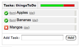
{dynamictasklist:thingsToDo}
|
Displays a dynamic tasklist. Tasks are added to the list and updated while viewing the page.
The single parameter is the title of the task list. Make sure you don't have two task-lists in the same page
with the same title.
Example:
|
Images
Images can be embedded into Confluence pages from attached files or remote sources.
| Notation |
Comment |
!http://www.host.com/image.gif!
or
!attached-image.gif!
|
Inserts an image into the page. If a fully qualified URL is given the imagewill be displayed from the remote source, otherwise an attached image file is displayed.
|
| !image.jpg|thumbnail! |
Insert a thumbnail of the image into the page (only works with images that are attached to the page). Users can click on the thumbnail to see the full-sized image. Thumbnails must be enabled by the site administrator for this to work.
|
| !image.gif|align=right, vspace=4! |
For any image, you can also specify attributes of the image tag as a comma separated list of name=value pairs like so.
|
{gallery}
{gallery:columns=3}
{gallery:slideshow=false}
{gallery:columns=3|title=Charles' Holiday Photos}
|
Create a gallery of thumbnails of all images attached to a page. This will only work on pagesthat allow attachments, obviously. The columns parameter allows you to specify the number of columns in the gallery (bydefault, 4) The title parameter allows you to supply a title for the gallery The slideshow parameter allows you to turn off the "View As Slideshow" link (on by default).
|
Tables
Tables allow you to organise content in a rows and columns, with a header row if required.
Advanced Formatting
More advanced text formatting.
| Notation |
Comment |
{noformat}
preformatted piece of text
so *no* further _formatting_ is done here
{noformat}
|
Makes a preformatted block of text with no syntax highlighting. All the optional parameters of {panel} macro are valid for {noformat} too.
- nopanel: If the value of "nopanel" is true, then the excerpt will be drawn without its surrounding panel.
Example:
|
{panel}Some text{panel}
{panel:title=My Title}Some text with a title{panel}
{panel:title=My Title| borderStyle=dashed| borderColor=#ccc| titleBGColor=#F7D6C1| bgColor=#FFFFCE}
a block of text surrounded with a *panel*
yet _another_ line
{panel}
|
Embraces a block of text within a fully customizable panel. The optional parameters you can define are the following ones:
- title: Title of the panel
- borderStyle: The style of the border this panel uses (solid, dashed and other valid CSS border styles)
- borderColor: The color of the border this panel uses
- borderWidth: The width of the border this panel uses
- bgColor: The background color of this panel
- titleBGColor: The background color of the title section of this panel
Example:
My Title
a block of text surrounded with a panel
yet another line
|
{code:title=Bar.java|borderStyle=solid}
// Some comments here
public String getFoo()
{
  return foo;
}
{code}
{code:xml}
<test>
    <another tag="attribute"/>
</test>
{code}
|
Makes a preformatted block of code with syntax highlighting. All the optional parameters of {panel} macro are valid for {code} too. The default language is Java but you can specify JavaScript, ActionScript, XML, HTML and SQL too.
Example:
public String getFoo()
{
return foo;
}
<test>
<another tag="attribute"/>
</test>
|
|
{index}
|
Displays an index of all the pages in the current space, cross linked and sorted alphabetically.
|
|
{content-by-user:fred}
|
Displays a simple table of all the content (pages, comments, news items, user profiles and space descriptions) created by a user (here fred).
|
{chart:title=Fish Sold}
|| Fish Type || 2004 || 2005 ||
|| Herring | 9,500 | 8,300 |
|| Salmon | 2,900 | 4,200 |
|| Tuna | 1,500 | 1,500 |
{chart}
{chart:type=line|title=Temperatures in Brisbane|yLabel=Celcius
|dataDisplay=true|dataOrientation=vertical}
|| Month || Min || Max ||
| January | 31.3 | 37.5 |
| February | 26.8 | 32.7 |
| March | 25.1 | 28 |
| April | 18.7 | 25.3 |
{chart}
{chart:type=timeSeries|dateFormat=MM.yyyy|timePeriod=Month|
dataOrientation=vertical|rangeAxisLowerBound=0|colors=blue,gray}
|| Month || Revenue ||
| 1.2005 | 31.8 |
| 2.2005 | 41.8 |
| 3.2005 | 51.3 |
| 4.2005 | 33.8 |
| 5.2005 | 27.6 |
| 6.2005 | 49.8 |
| 7.2005 | 51.8 |
| 8.2005 | 77.3 |
| 9.2005 | 73.8 |
| 10.2005 | 97.6 |
| 11.2005 | 101.2 |
| 12.2005 | 113.7 |
|| Month || Expenses ||
| 1.2005 | 41.1 |
| 2.2005 | 43.8 |
| 3.2005 | 45.3 |
| 4.2005 | 45.0 |
| 5.2005 | 44.6 |
| 6.2005 | 43.8 |
| 7.2005 | 51.8 |
| 8.2005 | 52.3 |
| 9.2005 | 53.8 |
| 10.2005 | 55.6 |
| 11.2005 | 61.2 |
| 12.2005 | 63.7 |
{chart}
|
Displays a chart using data from the supplied table or tables.
- type - The type of chart to display. May be:
- pie - A pie chart (default)
- bar - A bar chart
- line - A line chart
- area - An area chart
- XY plots - The standard XY plot has numerical x and y axes.
The x values may optionally be time based. See the timeSeries parameter.
- xyArea - A XY area chart
- xyBar - A XY bar chart
- xyLine - A XY line chart
- xyStep - A XY step chart
- xyStepArea - A XY step area chart
- scatter - A scatter plot
- timeSeries - A time series chart
- title - The title of the chart.
- xLabel - The label to use for the x axis
- yLabel - The label to use for the y axis
- legend - A legend will be displayed unless 'legend=false' is specified.
- width - The width of the chart in pixels (default is '300')
- height - The height of the chart in pixels (default is '300')
- dataDisplay - If 'true', the data table will be displayed below the chart.
- dataOrientation - The data table will be interpreted as columns (horizontally) representing domain and x values unless 'dataOrientation=vertical'.
- orientation - A bar, line, or area chart will be displayed vertically (y axis is vertical) unless 'orientation=horizontal' is specified.
- 3D - A pie, bar, or line chart will be shown in 3D if '3D=true' is specified.
- stacked - A bar or area chart will be shown with stacked values if 'stacked=true' is specified.
- dateFormat - For time series data, the date format determines the conversion of data to date values.
Specify a format that matches the format of the time series data. See Date Format.
- timePeriod - Specify the time period for time series data. Default is 'Day'.
Valid values are: Day, Hour, Millisecond, Minute, Month, Quarter, Second, Week, Year.
- timeSeries - If 'true', the x values in an XY plot will be treated as time series data and so will be converted according to dateFormat and timePeriod.
- opacity - A percent value between 0 (not visible) and 100 (non-transparent) that determines how opaque the foreground areas and bars display. Defaults are:
- 75 percent for 3D charts
- 50 percent for non-stacked area charts
- 100 percent for all other charts
- axis customization - Depending on the chart type, the range and domain axis may be customized.
These values are automatically generated based on the data but can be overridden by
specifying one or more more of these paramters.
- rangeAxisLowerBound - range axis lower bound
- rangeAxisUpperBound - range axis upper bound
- rangeAxisTickUnit - range axis units between axis tick marks
- domainAxisLowerBound - domain axis lower bound
- domainAxisUpperBound - domain axis upper bound
- domainAxisTickUnit - domain axis units between axis tick marks
- bgColor - Color (default is 'white') to use as the background of the chart.
See Colors.
- borderColor - Color of a border around the chart. Default is to not show a border.
See Colors.
- colors - Comma separated list of colors used to customize category, sections, and series colors.
See Colors.
Colors can be specified by name or hex value. See Web-colors.
The following are the valid color names that will automatically be converted.
| Color |
Hexadecimal |
Color |
Hexadecimal |
Color |
Hexadecimal |
Color |
Hexadecimal |
| black |
#000000 |
silver |
#c0c0c0 |
maroon |
#800000 |
red |
#ff0000 |
| navy |
#000080 |
blue |
#0000ff |
purple |
#800080 |
fuchsia |
#ff00ff |
| green |
#008000 |
lime |
#00ff00 |
olive |
#808000 |
yellow |
#ffff00 |
| teal |
#008080 |
aqua |
#00ffff |
gray |
#808080 |
white |
#ffffff |
Copied from Java SimpleDateFormat specification.
Date and time formats are specified by date and time pattern
strings.
Within date and time pattern strings, unquoted letters from
'A' to 'Z' and from 'a' to
'z' are interpreted as pattern letters representing the
components of a date or time string.
Text can be quoted using single quotes (') to avoid
interpretation.
"''" represents a single quote.
All other characters are not interpreted; they're simply copied into the
output string during formatting or matched against the input string
during parsing.
The following pattern letters are defined (all other characters from
'A' to 'Z' and from 'a' to
'z' are reserved):
Pattern letters are usually repeated, as their number determines the
exact presentation:
- Text:
For formatting, if the number of pattern letters is 4 or more,
the full form is used; otherwise a short or abbreviated form
is used if available.
For parsing, both forms are accepted, independent of the number
of pattern letters.
- Number:
For formatting, the number of pattern letters is the minimum
number of digits, and shorter numbers are zero-padded to this amount.
For parsing, the number of pattern letters is ignored unless
it's needed to separate two adjacent fields.
- Year:
For formatting, if the number of pattern letters is 2, the year
is truncated to 2 digits; otherwise it is interpreted as a
number.
For parsing, if the number of pattern letters is more than 2,
the year is interpreted literally, regardless of the number of
digits. So using the pattern "MM/dd/yyyy", "01/11/12" parses to
Jan 11, 12 A.D.
For parsing with the abbreviated year pattern ("y" or "yy"),
SimpleDateFormat must interpret the abbreviated year
relative to some century. It does this by adjusting dates to be
within 80 years before and 20 years after the time the SimpleDateFormat
instance is created. For example, using a pattern of "MM/dd/yy" and a
SimpleDateFormat instance created on Jan 1, 1997, the string
"01/11/12" would be interpreted as Jan 11, 2012 while the string "05/04/64"
would be interpreted as May 4, 1964.
During parsing, only strings consisting of exactly two digits, will be parsed into the default century.
Any other numeric string, such as a one digit string, a three or more digit
string, or a two digit string that isn't all digits (for example, "-1"), is
interpreted literally. So "01/02/3" or "01/02/003" are parsed, using the
same pattern, as Jan 2, 3 AD. Likewise, "01/02/-3" is parsed as Jan 2, 4 BC.
- Month:
If the number of pattern letters is 3 or more, the month is
interpreted as text; otherwise,
it is interpreted as a number.
- General time zone:
Time zones are interpreted as text if they have
names. For time zones representing a GMT offset value, the
following syntax is used:
     GMTOffsetTimeZone:
             GMT Sign Hours : Minutes

     Sign: one of
             + -
     Hours:
             Digit
             Digit Digit

     Minutes:
             Digit Digit
     Digit: one of
             0 1 2 3 4 5 6 7 8 9
Hours must be between 0 and 23, and Minutes must be between
00 and 59. The format is locale independent and digits must be taken
from the Basic Latin block of the Unicode standard.
For parsing, RFC 822 time zones are also
accepted.
- RFC 822 time zone:
For formatting, the RFC 822 4-digit time zone format is used:
     RFC822TimeZone:
             Sign TwoDigitHours Minutes
     TwoDigitHours:
             Digit Digit
TwoDigitHours must be between 00 and 23. Other definitions
are as for general time zones.
For parsing, general time zones are also
accepted.
|
{info:title=Useful Information}
This macro is useful for including helpful information in your confluence pages
{info}
|
Prints an informational note
- title: - (optional) the title of information box.
- icon: - (optional) if "false", don't display the icon.
|
{warning:title=Warning}
Insert warning message here!
{warning}
|
Prints a warning note to the user
- title: - (optional) the title of the warning.
- icon: - (optional) if "false", don't display the icon.
|
{tip:title=Handy Hint}
Join the Confluence Mailing-List!
{tip}
|
Prints a helpful tip for the user
- title: - (optional) the title of the tip.
- icon: - (optional) if "false", don't display the icon.
|
{note:title=Be Careful}
The body of the note here..
{note}
|
Prints a simple note to the user.
- title: - (optional) the title of the note.
- icon: - (optional) if "false", don't display the icon.
|
{repeating-data:Repeating Data|order=desc|initialRows=5}
Something: {text-data:Something}{text-data}
Something Else: {number-data:Something Else}{number-data}
{repeating-data}
|
Defines a repeating section. The contents of the macro will be repeated 0-n times,
depending how many have been added in edit mode.
Must be contained inside a scaffold macro.
- [default]/name - (required) The name of the field.
- order - (optional) If set to 'desc', the rows will list from bottom to top.
- initialRows - (optional) The number of times the section should be repeated initially.
|
|
{list-option:Label}*Wiki Text*{list-option}
|
Defines a simple option for a list.
Must be contained inside a list-data macro.
- [default] - (required) The non-wiki label for the option.
|
|
{text-data:Text Field}Default value{text-data}
|
Allows entering of text in a single- or multiple-line text field.
Must be contained inside a scaffold macro.
- [default]/name - (required) The name of the field.
- type - (optional) The type of field to display. May be one of the following:
- line - (default) A single-line text field.
- password - A single-line password field.
- area - A multi-line text area field.
- content - (optional) The type of content in the field. May be one of the following:
- wiki - (default) The content is wiki markup.
- text - The content is plain text.
- noformat - The content will appear inside a {noformat} section.
- quote - The content will be quoted.
- code:language - The content will be rendered as code, with an
optional programming language such as Java or XML. E.g. 'content=code:JavaScript'.
- min-length - (optional) The minimum number of characters that may be entered.
- max-length - (optional) The maximum number of characters that may be entered.
|
|
{date-data:List Field|format=dd-MMMM-yyyy}
|
Allows editing of date field.
Must be contained inside a scaffold macro.
- [default]/name - (required) The name of the field.
- format - (optional) The format of the date content. May contain any of the following special characters:
- y - The year (eg. 'yy' = '05', 'yyyy' = 2005).
- M - The month (eg. 'MMMM' = 'April', 'MMM' = 'Apr', 'MM' = '04').
- d - The day (eg. 'dd' = '09', 'd' = '9').
- H - The hour - 24 hour time (eg. 'HH' = '13').
- h - The hour - 12 hour time (eg. 'hh' = '01').
- m - The minute (eg. 'mm' = '23').
- s - The second (eg. 'ss' = '14').
- a - AM/PM (eg. 'a' = 'PM').
minYear - (optional) The minimum year that is allowed.
maxYear - (optional) The maximum year that is allowed.
|
{boilerplate:Template Name}
|
Imports the specified template to the current page. This is different
to creating a page using a template because it will always display the
latest version of the template, rather than copying the original version.
- [default]/name - (required) The template to import and display.
|
{table-data:Editable Table}
|| Name || Value || Expires ||
| {text-data:Name} | {number-data:Value} | {data-data:Expires|format=dd-MMM-yyyy} |
{table-data}
|
Defines an editable table. Should contain a single header row ('||') and a single
data row ('|'). The header row will be displayed once at the start of the table.
The data row will be repeated for each row in the table.
Make sure there are spaces around the '|' characters marking table cell boundaries.
Must be contained inside a scaffold macro.
- [default]/name - (required) The name of the field.
- order - (optional) If set to 'desc', the rows will list from bottom to top.
- initialRows - (optional) The number of times the section should be repeated initially.
|
{attachment-options:parent=A Page}
|
Creates a set of list options linking to
the attachments on the specified content the filter options.
Must be contained inside a list-data macro.
- content - (optional) If specified, the page or other content the files are attached to.
Defaults to the current page.
- filter - (optional) A regular expression filtering the attachment file name. E.g. ".*gif" for all GIF files.
|
{excerpt-data:Excerpt Field}{excerpt-data}
|
Allows editing of page's excerpt text via a text field. All the options for
{text-data} will work here.
Must be contained inside a scaffold macro.
|
|
{eval-data:Evaluated Field} ${Foo} + ${Bar} {eval-data}
{eval-data:Evaluated Field} round(${Foo} / ${Bar}, 2) {eval-data}
|
Evaluates mathematical equations, optionally using values from other
field data in the same scaffold. Other fields can be referenced by
putting them inside '${}' markers. The examples to the left
add and divide the current values of the 'Foo' and 'Bar' fields, respectively.
Must be contained inside a scaffold macro.
Parameters
- [default]/name - (required) The name of the field.
- format - (optional) The format the number should be output in when not being edited.
See java.text.DecimalFormat for details.
Functions
- round([number], [places]) - Rounds the number to the specified number of decimal places.
Eg:
round(1.4634, 2) rounds to 1.46.
- sumtable([table], [column]) - Sums the values of the specified column in the specified table.
Eg:
sumtable("My Table", "Number Column").
- avgtable([table], [column]) - Averages the values of the specified column in the specified table.
Eg:
avgtable("My Table", "Number Column").
|
{content-options:parent=A Page}
|
Creates a set of list options linking to
content matching the filter options.
Must be contained inside a list-data macro.
- parent - (optional) Only children of the specified page will be listed.
- ancestor - (optional) Any decendent of the specified page will be listed.
- spaces - (optional) Only lists pages from the specified list of spaces.
- branches - (optional) Specifies the type of pages that will be listed. May be one of:
- all - All page types are returned.
- parents - Only pages with children are listed.
- children - Only pages with no children are listed.
|
|
{user-options:groups=a-user-group}
|
Creates a set of list options linking to
users matching the filter options.
Must be contained inside a list-data macro.
- groups - (optional) Only users in the specified groups will be listed.
- spaces - (optional) Only users with the required access to the specified spaces will be listed.
Permissions can be specified for each space. Eg:
- SPACEKEY:view - (default) Only users with view access to the SPACEKEY will be listed.
- SPACEKEY:edit - Only users with edit access to the space will be listed.
- SPACEKEY:admin - Only users with administration access to the space will be listed.
- SPACEKEY:blog - Only users who can post a blog (aka News) message will be listed.
- users - (optional) Only users specified will be listed.
|
{scaffold:name=myScaffold|users=user1,user2|groups=group1,group2}scaffold data{scaffold}
|
Creates a framework for users to edit specific parts of the page
in a more structured way.
By default, anyone who has edit access to the page can modify
the page data.
- [default]/name - (required) The name of the scaffold.
- users - (optional) A comma-separated list of extra users who can edit the scaffold.
- groups - (optional) A comma-separated list of extra groups who can edit the scaffold.
|
{hidden-data}
Only visible when editing: {number-data:My Number}{number-data}
{hidden-data}
{hidden-data:whenEmpty=My Number}
Only visible when a number is set: {number-data:My Number}{number-data}
{hidden-data}
|
Hides its contents when viewing a page, but reveils it when editing.
Must be contained inside a scaffold macro.
- whenEmpty - (optional) If present, the field value specified will be checked,
and the contents of this hidden-data macro will be hidden if the field is empty.
- whenHasRows - (optional) If present, the table/repeation section specified will be checked,
and the contents of this hidden-data macro will be hidden if it has any rows.
- whenNoRows - (optional) If present, the table/repeation section specified will be checked,
and the contents of this hidden-data macro will be hidden if it has no rows.
|
{list-data:List Field}
{list-option:Label}Value{list-option}
{list-data}
|
Allows selecting one or more options.
Must be contained inside a scaffold macro.
- [default]/name - (required) The name of the field.
- type - (optional) The type of field to display. May be one of the following:
- select - (default) A selectable list is displayed.
- check - A list of checkable items are displayed.
required - (optional) If 'true', a non-empty item must be selected. Defaults to 'false'.
multiple - (optional) If 'true', multiple options may be selected.
width - (optional) The width of the field. Any CSS width is allowed. Note: Only applies when type is 'list'.
height - (optional) The height of the field. Any CSS height is allowed. Note: Only applies when type is 'list'.
|
|
{preset-options:key=uk-counties}
|
Creates a set of list build from pre-set values
provided by other plugins:
|
|
{number-data:Number Field}0{number-data}
|
Allows entering of a whole number value (eg 1, 4000).
Must be contained inside a scaffold macro.
- [default]/name - (required) The name of the field.
- type - (optional) The type of field to display. May be one of the following:
- line - (default) A single-line number field.
- select - A single-selection drop-down list box. Note:
this type requires that there is a maximum range of 1000 between
the min-value and max-value.
- decimal - (optional) If 'true', the field will allow decimal values to be entered.
Warning: Decimals are by their nature imprecise, and may result in some arithmatic errors at times.
Only use them if necessary, and don't expect min-value and max-value to always be precise as boundaries.
- minValue - (optional) The minimum value the number may be (inclusive).
- maxValue - (optional) The maximum value the number may be (inclusive).
- step - (optional) The amount each option should step when in 'select' mode. Eg. a step of 2 will produce options 1, 3, 5, etc. Defaults to 1.
- format - (optional) The format the number should be output in when not being edited.
See java.text.DecimalFormat for details.
|
|
{cache}
Something to cache for a day
{cache}
{cache:refresh=30m}
This will be cached for 30 minutes
{cache}
{cache:refresh=2 hours}
The excel data will be cached for 2 hours
{excel:file=^Report.xls}
{cache}
{cache:cron=30 * * * *|showRefresh=true|title=Refresh data from database}
This will be cached until 30 minutes past each hour of the day
{sql:dataSource=ReportDS}
select * from report
{sql}
{cache}
|
Caches the rendered contents of the body of this macro. Very useful when using macros
that might be slow to render content, but where it does not really
need to be dynamically generated for each and every request. Specifically, this can improve
performance for accessing dynamic data from sql, excel, and similar macros.
Cache will be refreshed if the body of the macro changes or if attachments
to this page have been added, removed, or have newer versions. The cache applies to all
users that view this page.
This macro may have restricted use for security reasons. See your administrator for details.
Optional Parameters
- refresh - Cache refresh period. Default is a day.
A number will be treated as seconds. A number followed by one of the
following characters will be treated as follows:
- s - seconds.
- m - minutes.
- h - hours.
- d - days.
Any data after a s, m, h, or d is ignored. For example, 10days is the same as 10d or 10 days.
- cron - Cron-like expression for finer grained expiration.
See Cron Expressions.
- showRefresh - Show a refresh icon if showRefresh=true. Default is false. When the refresh icon is clicked,
the cache for this macro will be discarded forcing the data to be regenerated.
- title - Title to show when mouse is over the refresh icon. Default is "Refresh".
Based on OSCache.
|
{html:script=#example.html}
{html}
{html:script=^example.html}
{html}
{html:output=wiki|noPanel=true}
Lorem ipsum dolor sit amet, consectetuer adipiscing elit.
Aliquam fermentum vestibulum est. Cras rhoncus.
{html}
{html:script=#http://localhost/example.html}
{html}
|
Includes HTML data into a Confluence page. HTML and BODY tags are removed when output=html
so the display of the Confluence page is not disrupted.
This macro may have restricted use for security reasons. See your administrator for details.
- output - Determines how the output is formated:
- html - Data is output as HTML (default).
- wiki - Data is surrounded by a {noformat} macro.
- script - Location of HTML data. Default is the macro body only. If a location of data is specified, the included data will follow the body data.
- #filename - Data is read from the file located in confluence home directory/script/filename. Subdirectories can be specified.
- #http://... - Data is read from the URL specified.
- ^attachment - Data is read from an attachment to the current page.
- page^attachment - Data is read from an attachment to the page name provided.
- space:page^attachment - Data is read from an attachment to the page name provided in the space indicated.
- noPanel - When output=wiki, show the data within a panel (default) unless nopanel=true.
|
{flash:file=^example.swf}
{flash:file=example.swf}
{flash:file=example.swf|play=false|loop=false|bgcolor=#00FF00}
{flash:file=EXAMPLE:Example page^example.swf|show=link|title=Flash example}
{flash:url=http://.../example.swf}
{flash:file=example.swf}
|
Show flash based content on a confluence page.
- file - Location of flash file. One of the file or url parameters must be specified.
- filename - Data is read from the file located in confluence home directory/flash/filename. Subdirectories can be specified.
- ^attachment - Data is read from an attachment to the current page.
- page^attachment - Data is read from an attachment to the page name provided.
- space:page^attachment - Data is read from an attachment to the page name provided in the space indicated.
- url - URL of flash file. Only used if file parameter is not provided.
- http://... - Data is read from the URL specified.
- width - The table width in pixels. Default is 100%.
- height - The table height in pixels. Default is 100%.
- show - Default is to show the flash content on the page. Set show=link to show as a link to the content.
- title - Title to use for the link when show=link is specified.
Default is the name of the flash file or url.
- Other flash specific parameters - All other parameters are passed through to flash. See
Flash reference information.
Here is is a partial list.
- ID - Identifies the Flash movie to the host environment (a web browser, for example) so that it can be referenced using a scripting language. OBJECT-specific.
- NAME - Identifies the Flash movie to the host environment (a web browser, typically) so that it can be referenced using a scripting language such as JavaScript or VBScript. EMBED-specific.
- SWLIVECONNECT - (true, false) Specifies whether the browser should start Java when loading the Flash Player for the first time. The default value is false if this attribute is omitted. If you use JavaScript and Flash on the same page, Java must be running for the FSCommand to work.
- PLAY - (true, false) Specifies whether the movie begins playing immediately on loading in the browser. The default value is true if this attribute is omitted.
- LOOP - (true, false) Specifies whether the movie repeats indefinitely or stops when it reaches the last frame. The default value is true if this attribute is omitted.
- MENU (true, false)
- True displays the full menu, allowing the user a variety of options to enhance or control playback.
- False displays a menu that contains only the Settings option and the About Flash option.
- QUALITY - (low, high, autolow, autohigh, best )
- SCALE - (showall, noborder, exactfit)
- Default (Show all) makes the entire movie visible in the specified area without distortion, while maintaining the original aspect ratio of the movie. Borders may appear on two sides of the movie.
- No Border scales the movie to fill the specified area, without distortion but possibly with some cropping, while maintaining the original aspect ratio of the movie.
- Exact Fit makes the entire movie visible in the specified area without trying to preserve the original aspect ratio. Distortion may occur.
- ALIGN - (l, t, r, b)
- Default centers the movie in the browser window and crops edges if the browser window is smaller than the movie.
- Left, Right, Top, and Bottom align the movie along the corresponding edge of the browser window and crop the remaining three sides as needed.
- SALIGN - (l, t, r, b, tl, tr, bl, br)
- L, R, T, and B align the movie along the left, right, top or bottom edge, respectively, of the browser window and crop the remaining three sides as needed.
- TL and TR align the movie to the top left and top right corner, respectively, of the browser window and crop the bottom and remaining right or left side as needed.
- BL and BR align the movie to the bottom left and bottom right corner, respectively, of the browser window and crop the top and remaining right or left side as needed.
- WMODE - (window, opaque, transparent) Sets the Window Mode property of the Flash movie for transparency, layering, and positioning in the browser.
- Window movie plays in its own rectangular window on a web page.
- Opaque the movie hides everything on the page behind it.
- Transparent the background of the HTML page shows through all transparent portions of the movie, this may slow animation performance.
- BGCOLOR - (#RRGGBB, hexadecimal RGB value) Specifies the background color of the movie. Use this attribute to override the background color setting specified in the Flash file. This attribute does not affect the background color of the HTML page.
|
{csv}
, January, February, March, April
Max, 37.5, 32.7, 28.0, 25.3
Min, 31.3, 26.8, 25.1, 18.7
{csv}
{csv:output=wiki|width=900|border=15|delimiter=whitespace}
Month Max Min Average
January 25.5 *6.3* 15.9
February 32.4 12.8 22.6
March 44.6 24.5 34.6
April 59.7 37.1 48.4
May 72.5 48.7 60.6
June 81.3 57.9 69.6
July 85.2 62.8 74
August 82.5 60.7 71.6
September 73.7 51.7 62.7
October 61.1 40.1 50.6
November 43.6 27.4 35.5
December 29.9 13.6 21.8
{csv}
|
Converts csv and other deliminated data into a table.
- output - Determines how the output is formated:
- html - Data is output as a HTML table (default).
- wiki - Data is output as a Confluence wiki table. Use this option if you want data within the table to be formated by the Confluence wiki renderer.
- script - Location of csv data. Default is the macro body only. If a location of data is specified, the included data will follow the body data.
- #filename - Data is read from the file located in confluence home directory/script/filename. Subdirectories can be specified.
- global page template name - Data is read from a global page template.
- space:page template name - Data is read from a space template.
- ^attachment - Data is read from an attachment to the current page.
- page^attachment - Data is read from an attachment to the page name provided.
- space:page^attachment - Data is read from an attachment to the page name provided in the space indicated.
- heading - Number of rows to be considered heading rows (default is 1 row). Specify heading=false or heading=0 to not show any heading lines.
- border - The border width in pixels. Defaults to normal table border width.
- width - The table width in pixels. Default is 100%.
- delimiter - Delimiter that separates columns. Note that trailing delimiters on a line result in a blank column at the end of the row.
- , or "," (comma) - The default column separator.
- whitespace - Blanks, tabs, and other white space are used to separate columns.
- blanks - Blank or blanks only.
- other single character delimiter - may be within double quotes with some restictions. Examples: ";", "=",
- quote - the character used to represent quoted data. Quoted data may contain delimiters or new lines. Quote character data must be doubled inside a quoted string.
- double - Double quote character (default).
- single - Single quote character.
- escape - When wiki output is requested (output=wiki), some special characters (like '|', '[', ']', '{', '}') in data may cause undesirable formatting of the table.
Set escape=true to allow these special characters to be escaped so that it will not affect the formatting.
The default is false so that data that has wiki markup will be handled correctly.
- showWiki - Default is false. Set to true to show a non-formatted version of the wiki table following the formatted table.
This is used to help resolve formating issues.
- highlightRow - As the mouse moves over a table row, the row will be highlighted by default.
Set highlightRow=false to stop this behavior.
|
{table-plus}
|| || January || February || March || April ||
| Max | 37.5 | 32.7 | 28.0 | 25.3 |
| Min | 31.3 | 26.8 | 25.1 | 18.7 |
{table-plus}
{table-plus:width=500|border=15|highlightRow=false|columnTypes=S,F,F,F}
|| Month || Max || Min || Average ||
| January | 25.5 | *6.3* | 15.9 |
| February | 32.4 | 12.8 | 22.6 |
| March | 44.6 | 24.5 | 34.6 |
| April | 59.7 | 37.1 | 48.4 |
Other text can be here too!
{table-plus}
|
Adds column sorting and other attributes to one or more tables found in the body of the macro.
The tables can be produced by wiki markup or other means.
Note that the excel, csv, or sql macros already have most of these capabilities.
Clicking on a column heading will cause that column to be sorted. Clicking again will reverse the order.
- heading - Number of rows to be considered heading rows (default is 1 row).
Specify heading=false or heading=0 to not show any heading lines.
Heading rows do not participate in sorting.
- width - The table width in pixels. Default is 100%.
- border - The border width in pixels. Defaults to normal table border width.
- highlightRow - As the mouse moves over a table row, the row will be highlighted by default.
Set highlightRow=false to stop this behavior.
- columnTypes - By default, all columns are treated as strings for sorting purposes.
Specify a comma separated list of column type indicators to identify column types.
- string - S
- integer - I
- float - F
- Other parameters - Other parameters are passed through to the html table markup for more advanced
capabilities or to override the default class
|
{xslt:style=^cdcatalog.xsl}
<catalog>
<cd>
<title>Empire Burlesque</title>
<artist>Bob Dylan</artist>
<country>USA</country>
</cd>
<cd>
<title>Maggie May</title>
<artist>Rod Stewart</artist>
<country>UK</country>
</cd>
</catalog>
{xslt}
{xslt:source=^cdcatalog.xml|style=#http://www.w3schools.com/xsl/cdcatalog.xsl}
{xslt}
|
Transforms XML to a Confluence page via an XSLT style sheet.
This macro may have restricted use for security reasons. See your administrator for details.
- output - Determines how the output is formated:
- html - Data is output as a HTML (default).
- wiki - Data is output as Confluence wiki text. Use this option if you want the data to be formated by the Confluence wiki renderer.
- source - Location of source XML code. Default is the macro body.
- #filename - Data is read from the file located in confluence home directory/script/filename. Subdirectories can be specified.
- #http://... - Data is read from the URL specified.
- global page template name - Data is read from a global page template.
- space:page template name - Data is read from a space template.
- ^attachment - Data is read from an attachment to the current page.
- page^attachment - Data is read from an attachment to the page name provided.
- space:page^attachment - Data is read from an attachment to the page name provided in the space indicated.
- style - Location of source XSL code. Required if source XML is in the macro body, otherwise defaults to the macro body.
- #filename - Data is read from the file located in confluence home directory/script/filename. Subdirectories can be specified.
- #http://... - Data is read from the URL specified.
- global page template name - Data is read from a global page template.
- space:page template name - Data is read from a space template.
- ^attachment - Data is read from an attachment to the current page.
- page^attachment - Data is read from an attachment to the page name provided.
- space:page^attachment - Data is read from an attachment to the page name provided in the space indicated.
|
{graph-from-table}
| A | B |
| A | C |
{graph-from-table}
{graph-from-table}
|| heading 1 ignored || heading 2 ignored ||
| A node | B node | label="relationship 1", style=dashed | style=normal | fillcolor=lightblue |
| A node | C node |
| A node | D node | style=invis |
{graph-from-table}
{graph-from-table:node=fillcolor=lightblue,fontsize=20|edge=style=bold,color=red|
replace=key1:'style=dashed, color=blue', key2:style=invis|ranksep=2.0}
| A node | B node | | shape=polygon,sides=8,peripheries=3 | |
| A node | B node | | style=dashed |
| A node | C node |
| A node | D node | key2 |
Here is a second table
| E | F | key1 |
| F | G | key1 |
{graph-from-table}
{graph-from-table:direction=LR|ranksep=1.5|node=fillcolor=lightblue,fontsize=20|
edge=style=bold,color=red|replace=key1:style=dashed}
| A node | B node | label="r1" | | | cluster 1 | key1 |
| F | G | key1 | | | cluster 1 |
| X | Y | key1 | | | cluster 1 | | big cluster |
{graph-from-table}
{graph-from-table:direction=LR|edge=color=blue|displayData=true}
{sql:dataSource=ConfluenceDS}
select PARENTID, TITLE from CONTENT where PARENTID is not NULL
{sql}
{graph-from-table}
|
Converts a table into a Graphviz graph by rendering the body of the macro and then converting each row
in each table to a node relationship. A flowchart macro is used for the rendering. This macro simplifies use
of the Graphviz support by eliminating or significantly reducing the need to know the dot language.
Advanced users will still need to consult the Graphviz documentation for the multitude of attributes and settings that
are possible.
The table or tables specified in the body of the macro can be wiki markup or created as a result of other macros.
Specifically, the sql, csv, and excel macros can be used to produce the tables.
The columns in the table are interpreted as follows:
- Node with label equal to the column. The source of a relationship.
- Node with label equal to the column. The target of a relationship.
- Relationship attributes.
- Source node attributes.
- Target node attributes.
- First cluster label. A cluster is a subgraph that contains the source and target nodes for this row.
- First cluster attributes. For instance, if you do not want a label to show for the cluster, put label=""
- Second cluster label. The second cluster is a subgraph that contains the first cluster.
- Second cluster attributes.
Attributes are defined by Graphviz for nodes, relationships, and subgraphs (clusters).
They are specified as comma separated list. Attribute values containing blanks must be surrounded by double quotes.
Some commonly used attributes are:
- label - text to display
- style - examples: filled, bold, dotted, dashed, invis (for invisible)
- fillcolor - node fill color
- fontname - standard font name (enclosed in double quotes if contains a blank)
- fontsize - standard font size
- fontcolor - color usually specified as a color name like blue, grey, lightyellow
- shape - examples: rect, box, circle, ellise, triangle, polygon (together with sides attibutes), diamond, ...
- sides - number of sides for a polygon shape
- peripheries - number of node boundaries
References:
Parameters - all are optional:
- displayData - Default is false. Set to true to show the rendered body data after the graph.
This is useful to see the results of a sql macro for instance.
- node - The default node attributes are: shape=rect, style=filled, fillcolor=lightyellow, fontname="Verdana", fontsize=9.
The default attributes are taken from the default flowchart macro behavior.
By specifying the node parameter, you can override these defaults or add additional default attributes.
See the Graphviz Documentation
for information on attributes and settings.
- edge - The default edge attributes are: arrowsize=0.8.
The default attributes are taken from the default flowchart macro behavior.
By specifying the edge parameter, you can override these defaults or add additional default attributes.
See the Graphviz Documentation
for information on attributes and settings.
- direction - The default layout direction is top to bottom (TB).
Set direction=LR to layout in a left to right direction.
This is equivalent to the rankdir setting.
- columns - Allows selection of the columns of the table that will be used for the graph.
It must be a comma separated list of 1 or more positive integers in any order.
The default is columns=1,2,3,4,5,6,7,8,9.
If the table does not contain the column indicated, it will be ignored.
For example, if columns=3,13 then column 3 will be used for the source node and column 13 will
be used for the target node of the relationship. All other columns will be ignored.
- replace - A comma separated list of key:value pairs that will be used to convert column values to attributes.
If a column value for an attribute column matches one of the keys, the associated value will
replace the column value. This makes it easy to associate attributes to column data.
If more than one attribute needs to be specified for a key, enclose the value in a single quote
so that the comma gets treated as a attribute separator.
- ... - All other parameters are passed through to Graphviz for setting any global Graphviz parameter.
Some common examples are:
- ranksep - Separation in inches between nodes.
- bgcolor - Background color.
- size - Size specified as width, height in inches. Example: size="3,5".
|
{sql:dataSource=TestDS|output=wiki}
select * from test
{sql}
There are *{sql:dataSource=TestDS|table=false} select count(*) from test01 {sql}* rows in table test01
{sql:dataSource=TestDS|p1=%test%|showsql=true}
select * from test01 where a1 like ?
{sql}
|
Displays the result table or values from the SQL query.
This macro may have restricted use for security reasons. See your administrator for details.
- dataSource - Required parameter. Formerly known as the jndi parameter.
For compatibility the jndi parameter will be still be used if the dataSource parameter is missing.
Specify the datasource name defined in the application server.
Do not use the standard prefix (java:comp/env/jdbc/) as it is added automatically if necessary.
Specific values of this parameter may be restricted for security reasons. See your administrator for details.
- output - Determines how the output is formated:
- html - Data is output as a HTML table (default).
- wiki - Data is output as a Confluence wiki table. Use this option if you want data within the table to be formated by the Confluence wiki renderer.
- script - Location of sql statement. Default is the macro body only.
- #filename - Data is read from the file located in confluence home directory/script/filename. Subdirectories can be specified.
- global page template name - Data is read from a global page template.
- space:page template name - Data is read from a space template.
- ^attachment - Data is read from an attachment to the current page.
- page^attachment - Data is read from an attachment to the page name provided.
- space:page^attachment - Data is read from an attachment to the page name provided in the space indicated.
- heading - Number of rows to be considered heading rows (default is 1 row). Specify heading=false or heading=0 to not show any heading lines.
- border - The border width in pixels. Defaults to normal table border width.
- width - The table width in pixels. Default is 100%.
- rowOrientation - By default, data is oriented with rows appearing vertically (in rows) and columns in columns.
Specify rowOrientation=horizontal to have rows appear horizontally (as columns) and columns appear as rows.
- useColumnLabel - By default, database column names are used as column labels. Specify useColumnLabels=true to have database column
labels used for column labels. Note that most databases default the column label to be the column name when no explicit column label is provided.
Fly-over text for a column label will be the column name when useColumnLabel=true.
Fly-over text for a column label will be the database column label when useColumnLable=false or by default.
- escape - When wiki output is requested (output=wiki), some special characters (like '|', '[', ']', '{', '}') in data may cause undesirable formatting of the table.
Set escape=true to allow these special characters to be escaped so that it will not affect the formatting.
The default is false so that data that has wiki markup will be handled correctly.
- convertNull - Default is true. Converts SQL NULL values to blank. Set to false to have NULL values show up as 'null'.
- highlightRow - As the mouse moves over a table row, the row will be highlighted by default.
Set highlightRow=false to stop this behavior.
- table - Default is true. Set to false to not format the data in a table.
This option can be used to run queries that produce single values that you want to include in text.
- noDataError - Default is false. Set to true to show an macro error when no data is returned from the query.
- showSql - Default is false. Set to true to show a panel with the sql statement.
- SQL parameter markers - SQL supports parameter markers in statements - these are identified by ?'s.
Parameters p1, p2, ... are substititued for the parameter markers.
This can be used to parameterize complex scripts stored as attachments or files.
- p1 - first parameter marker
- p2 - second parameter marker
- ... - ...
|
{cloak:id=Cloaked Content}
This section will be cloaked until it is toggled.
{cloak}
|
Creates a cloaked section which can be toggled
between being visible and hidden.
Note: Requires that {composition-setup}
is placed above it in the page.
- id - (required) The unique ID of the cloaked section.
- visible - (optional) If 'true', the section will be visible initially.
Defaults to 'false'.
|
Tabbed deck
{deck:id=My Deck}
{card:label=Card 1}
Card 1 contents.
{card}
{card:label=Card 2}
Card 2 contents.
{card}
{deck}
Slideshow
{deck:id=My Deck|effectType=fade|nextAfter=5|loopCards=true|tabLocation=none}
{card:label=Card 1}
!image1.png!
{card}
{card:label=Card 2}
!image2.png!
{card}
{deck}
|
Creates a new deck of 'cards' - sections of content
which are displayed one at a time. By default, tabs similar to those in the default Confluence
theme are displayed.
Note: Requires that {composition-setup}
is placed above it in the page.
- id - (required) The unique ID of the deck section.
- tabLocation Either 'top', 'bottom' or 'none'. Defaults to 'top'.
- class - The custom CSS class the deck will be placed in.
- width/height - The width and/or height the content will be constrained to (not including any tabs).
If not set, the tabs expand to display their content.
- startHidden - If set to 'false', the cards will be initially visible on the page until setup is complete. Defaults to 'true'.
- loopCards - If 'true', the deck will loop back to the beginning from the last card and vice versa. Defaults to 'false'.
- nextAfter - The number of seconds the slides will stay visible before moving to the next one.
By default the current slide will not transition until prompted by the user.
- effectType - The effect to use when moving to a new slide. May be 'fade' or 'none' (the default).
- effectDuration - The number of seconds the transition will take to complete. Eg. '1.5'. Defaults to 1.
|
{card:label=Card 1}
Card 1 contents.
{card}
{card:label=*Card 2*|default=true|accessKey=c}
Card 2 contents.
{card}
|
Creates a new card. Must be inside a 'deck'.
Only one card is visible at any given time.
- label - (required) The label to put on the tab.
- default - (optional) If true, the card will be the default. The last card
in the deck marked as 'default' will be the default.
- accessKey - (optional) The key that, when combined with {{Ctrl}} will activate
the card.
- class - (optional) The custom CSS class for the tab.
- nextAfter - The number of seconds the slide will stay visible before moving to the next one.
By default the current slide will not transition until prompted by the user.
- effectType - The effect to use when moving to this slide. May be 'fade' or 'none' (the default).
- effectDuration - The number of seconds the transition will take to complete. Eg. '1.5'
|
{composition-setup:defaults=Home^composition.properties}
cloak.memory.duration = 3 #days
cloak.toggle.type = custom
cloak.toggle.open = ^open.gif
cloak.toggle.close = ^close.gif
{composition-setup}
|
Performs setup operations for some of the composition macros. Some macros
require that this has been put at the top of a page for them to work. It allows page-wide
settings for macros. Its contents is a list of properties, as listed below.
Parameters:
- defaults - (optional) the link to the default property attachment.
E.g. "Home^defaults.txt". This allows easy setting of defaults for multiple
pages.
Properties:
- import.css - The path to the CSS file to import. May be a page attachment (eg. "^style.css")
or a regular URL.
- cloak.memory.duration - The number of days to remember the state of the page.
Set to 0 to disable memory altogether. Defaults to 7 days.
- cloak.toggle.type - (optional) The type of toggle to display. May be:
- default - (default) Blue arrows pointing up or down.
- custom - Allow custom images as the icons. You must set 'cloak.toggle.open'
and 'cloak.toggle.close' when using this option.
- text - Allow any regular text as the icons. You must set 'cloak.toggle.open'
and 'cloak.toggle.close' when using this option.
- wiki - Allow regular wiki text (except links). You must set 'cloak.toggle.open'
and 'cloak.toggle.close' when using this option.
- none - No icon will be output at all. You will probably want to make sure that
'cloak.toggle.zone' is set to true with this option.
- cloak.toggle.open - If 'cloak.toggle.type' is set to 'text' or 'custom', this what
the toggle will contain when the cloak contents can be expanded.
E.g. If in 'text' mode, a good value might be '+'. If in 'custom' mode, either an absolute URL
('http://.../open.gif'), a relative URL ('/.../open.gif') or a Confluence attachment link
('[SPACEKEY:][Page]^open.gif') must be provided.
- cloak.toggle.close - If 'cloak.toggle.type' is set to 'text' or 'custom', this is
what the toggle will contain when the cloak contents can be hidden.
E.g. If in 'text' mode, a good value might be '-'. If in 'custom' mode, either an absolute URL
('http://.../close.gif'), a relative URL ('/.../close.gif') or a Confluence attachment link
('[SPACEKEY:][Page]^close.gif') must be provided.
- cloak.toggle.exclusive - (optional) If
true, all cloaked sections will be
exclusive - that is, only the current section will be visible at any given time. Defaults to 'false'.
- cloak.toggle.zone - (optional) If
true, the paragraph or heading any toggle
icons are placed in can also be clicked to toggle the associated cloak section. Defaults to 'true'.
- deck.memory.duration - The number of days to remember the state of the decks on the page.
Set to 0 to disable memory altogether. Defaults to 7 days.
- deck.class - The custom CSS class to apply to all decks
- deck.tab.location - 'top', 'bottom' or 'none'. The location of the tab bar.
- deck.tab.active.border - The border for the active tab (CSS - eg. '1px dashed black')
- deck.tab.active.background - The background for the active tab (CSS - eg. '#ff0055')
- deck.tab.inactive.border - The border for inactive tabs (CSS)
- deck.tab.inactive.background - The background for inactive tabs (CSS)
- deck.tab.spacer - The distance between tabs (eg '5px')
- deck.card.border - The border for the active card.
- deck.card.background - The background for the active card.
- deck.width/deck.height - The width and/or height the content will be constrained to (not including any tabs).
If not set, the tabs expand to display their content.
- deck.startHidden - If set to 'false', the cards will be initially visible on the page until setup is complete. Defaults to 'true'.
- deck.loopCards - If 'true', the deck will loop back to the beginning from the last card and vice versa. Defaults to 'false'.
- deck.nextAfter - The number of seconds the slides will stay visible before moving to the next one.
By default the current slide will not transition until prompted by the user.
- deck.effect.type - The effect to use when moving to a new slide. May be 'fade' or 'none' (the default).
- deck.effect.duration - The number of seconds the transition will take to complete. Eg. '1.5'. Defaults to 1.
|
{float:right|width=50px|background: #F0F0F0|border: solid navy}
This will float to the right.
{float}
|
Creates a weekly booking sheet with the list of items able to be booked by
logged-in users. All options below such as width, background and padding support valid
CSS options for the properties of the same name.
- [default]/side - (required) The side the content will float on (left or right).
- width - (optional) The width of the floating content (eg. '100px').
- background - (optional) The background colour or picture settings.
- border - (optional) The border settings.
- margin - (optional) The margin settings.
- padding - (optional) The padding settings.
|
|
h1. {toggle-cloak:id=Cloaked Content} Cloaked Content
|
Creates a button to toggle a cloaked section between
being visibile and hidden.
Note: Requires that {composition-setup}
is placed above it in the page.
- id - (required) The unique ID of the cloaked section to toggle.
- exclusive - (optional) If
true, all other sections at the same level
will be cloaked when this is shown.
|
{show-card:deck=My Deck|card=A Card}Show A Card{show-card}
{show-card:deck=My Deck|card=@next|scrollTo=false}Show next card{show-card}
|
Shows a card in the specified deck.
- deck - (required) The id of the deck.
- card - (required) Either the label of the card, or one of the following special labels:
- @first - Show the first card in the deck.
- @last - Show the last card in the deck.
- @next - Show the next card after the currently-visible one. If the deck loops, it will show the first card if the current card is the last.
- @prev - Show the card previous to the currently-visible one. If the deck loops, it will show the last card if the current card is the first.
- scrollTo - (optional) If set to false, the browser will not scroll to the deck. Defaults to true.
|
{flowchart}
A -> B
A -> C
C -> D
{flowchart}
|
Displays a flowchart diagram drawn using the GraphViz language. Some defaults are set to
match the Confluence look.
|
{graphviz}
digraph {
A -> B
A -> C
C -> D
}
{graphviz}
|
Displays a graph drawn using the GraphViz language.
|
|
{sudoku-printable:difficulty}
|
Displays a printable sudoku grid of the chosen dificulty, if no difficulty is selected then 'normal' will be used
- easy - The easiest skill level will be displayed
- normal - The normal skill level will be displayed
- hard - The hard skill level will be displayed
See Also: User Guide and Examples
|
|
{sudoku-js}
|
Displays a javascript driven interactive sudoku game
See Also: User Guide and Examples
|
|
{sudoku-highscores:display=type}
|
Displays either the user's personal high scores, or the overall leaderboard
The type may be one of the following values:
- personal - The user's personal high scores will be displayed (This will be the default value when none is specified and the high scores macro is displayed within a user profile)
- leaderboard - The overall 'leaderboard' high scored will be displayed (This will be the default value when none is specified and the high scores macro is displayed on a normal page)
See Also: User Guide and Examples
|
|
{sudoku:defaultTileset=tiletype|allowchange=true|helpsource=Home}
|
Displays an interactive sudoku game using Macromedia/Adobe Flash for the UI
Parameters:
- defaultTileset - Allows setting of the tileset initially displayed to the user, this parameter can have one of the following values
- ninjafarm
- footballmadness
- chinese
- digital (default)
- eggheads
- greenwithenvy
- decimal
- redherring
- villainsandheroes
- occupationalhazzard
- roman
- starstruck
- roadrage
- allowChange - A true/false flag to state whether the game player can change the tile-set from its default value or not (default is 'true')
- helpsource - The name of a page to which a text file 'sudoku.txt' is attached, this text file is used to populate the instructions display on the main page of the interface (deafults to the current page)
See Also: User Guide and Examples
|
|
{sudoku-hiscores:display=type}
|
Displays either the user's personal high scores, or the overall leaderboard
The type may be one of the following values:
- personal - The user's personal high scores will be displayed (This will be the default value when none is specified and the high scores macro is displayed within a user profile)
- leaderboard - The overall 'leaderboard' high scores will be displayed (This will be the default value when none is specified and the high scores macro is displayed on a normal page)
See Also: User Guide and Examples
|
|
{sudoku-flash:defaultTileset=tiletype|allowchange=true|helpsource=Home}
|
Displays an interactive sudoku game using Macromedia/Adobe Flash for the UI
Parameters:
- defaultTileset - Allows setting of the tileset initially displayed to the user, this parameter can have one of the following values
- ninjafarm
- footballmadness
- chinese
- digital (default)
- eggheads
- greenwithenvy
- decimal
- redherring
- villainsandheroes
- occupationalhazzard
- roman
- starstruck
- roadrage
- allowChange - A true/false flag to state whether the game player can change the tile-set from its default value or not (default is 'true')
- helpsource - The name of a page to which a text file 'sudoku.txt' is attached, this text file is used to populate the instructions display on the main page of the interface (deafults to the current page)
See Also: User Guide and Examples
|
|
{sudoku-logo:size=pixelwidth}
|
Displays either the logo used in the flash UI
The size defines the width of the logo displayed, the height is derived automatically from the width to keep the logo proprtional
See Also: User Guide and Examples
|
{hide-if:type=news|display=printing|space=MYSPACE|action=edit}
This text is hidden if the page is a news item, is in printing mode,
is in MYSPACE, or is being edited.
{hide-if}
|
Shows its content if the context does not meet any of the specified requirements.
- type(s) - (optional) the (list of) page types. May be:
- page
- news
- comment
- spacedescription
- display(s) - (optional) the (list of) display modes. May be:
- space(s) - (optional) the (list of) spaces.
- action(s) - (optional) the action taking place.
- view - The content is editable and is currently being viewed.
- edit - The content is editable and is currently being edited.
- template - The content is a template being previewed.
- dashboard
- The content is the dashboard.
match - If set to 'all', then all items listed must match. Defaults to 'any'.
trim - If set to 'false', the content will not be trimmed before being output (if appropriate).
|
{hide-from:user=bob|group=a-group,another-group|space=MYSPACE:edit}
This text is only hidden from bob, users in a-group or another-group,
and users who can edit the MYSPACE Space.
{hide-from}
|
Shows the content to users who do not meet any of the specified requirements.
- user: - (optional) the (list of) users who cannot see the content.
- group: - (optional) the (list of) groups who cannot see the conent.
- space:perm - (optional) the (list of) spaces where, if the user can view
the space, they cannot see the content. The user's permission type to that space may be added also.
- view - (default) the user has permission to view the space.
- edit - the user has permission to edit pages.
- admin - the user has administration access.
- news - the user has permission post a news entry.
- trim - (optional) if 'true' (the default), the content will be trimmed of whitespace at its beginning and end. (default).
- match - (optional) specify the match type.
- any - (default) the content is hidden if the user matches any of the criteria.
- all - the content is hiddent if the user matches *all* the criteria.
|
{show-to:user=bob|group=a-group,another-group|space=MYSPACE:edit}
This text is only visible to bob, users in a-group or another-group,
and users who can edit the MYSPACE Space.
{show-to}
|
Shows the content to users who meet any of the specified requirements.
- user - (optional) the (list of) users who can see the content.
- group - (optional) the (list of) groups who can see the conent.
- space:perm - (optional) the (list of) spaces where, if the user can view
the space, they can see the content. The user's permission type to that space may be added also.
- view - (default) the user can view the space.
- edit - the user can edit pages.
- admin - the user has administration access.
- news - the user can post a news entry.
- trim - (optional) if 'true' (the default), the content will be trimmed of whitespace at its beginning and end. (default).
- match - (optional) specify the match type.
- any - (default) the content is displayed if the user matches any of the criteria.
- all - the content is displayed if the user matches *all* the criteria.
|
{show-if:type=news|display=printing|space=MYSPACE|action=edit}
This text is show if the page is a news item, is in printing mode,
is in MYSPACE, or is being edited.
{show-if}
|
Shows its content if the context meets any of the specified requirements.
- type(s) - (optional) the (list of) page types. May be:
- page
- news
- comment
- spacedescription
- display(s) - (optional) the (list of) display modes. May be:
- space(s) - (optional) the (list of) spaces.
- action(s) - (optional) the action taking place.
- view - The content is editable and is currently being viewed.
- edit - The content is editable and is currently being edited.
- template - The content is a template being previewed.
- dashboard
- The content is the dashboard.
match - If set to 'all', then all items listed must match. Defaults to 'any'.
trim - If set to 'false', the content will not be trimmed before being output (if appropriate).
|
Confluence Content
Ways to include, summarise or refer to other Confluence content.
| Notation |
Comment |
{excerpt}Confluence is a knowledge-sharing application that enables teams to communicate more effectively{
{excerpt:hidden=true}This excerpt will be recorded, but will not be displayed on the page.{
|
Marks some part of the page as the pages excerpt. This doesnt change the display of the page at all, but other macros (for example children, excerpt-include and blog-posts) can use this excerpt to summarise the pages content.
- hidden: If the value of "hidden" is true, then the contents of the excerpt macro will not appear on the page.
|
{include:Home}
{include:FOO:Home}
{include:spaceKey=FOO|pageTitle=Home}
|
Includes one page within another (this example includes a page called "Home"). Pages from another space can be included by prefacing the page title with a space key and a colon.
The user viewing the page must have permission to view the page being included, or it will not be displayed.
|
{excerpt-include:Home}
{excerpt-include:Home|nopanel=true}
|
Includes the excerpt from one page (see the excerpt macro) within another. The included page must be in the same space as the page on which the macro is used.
- nopanel: If the value of "nopanel" is true, then the excerpt will be drawn without its surrounding panel.
|
{search:query=my_query}
{search:query=my_query|maxLimit=x}
|
Does an inline site search.
- query: your query
- maxLimit=x: (where x is any number > 0) to limit the search result to a number of results.
- spacekey: specify the key of the space you want to search in
- type: specify the content type (could be page, comment, blogpost, attachment, userinfo, spacedesc)
- lastModified: specify a time period in which the content was last modified: (e.g. 3d = modified in the last 3 days, 1m3d = modified in the last month and three days)
Example:
Found 2 result(s) for home
|
{children}
{children:all=true}
{children:depth=x}
{children:depth=x|style=h3}
{children:excerpt=true}
{children:page=Another Page}
{children:page=/}
{children:page=SPACEKEY:}
{children:first=x}
{children:sort=<mode>|reverse=<true or false>}
|
Displays the children and descendants of the current page. Specify all=true to show all descendants of this page, or depth=x (where x is any number > 0) to show that many levels of descendants. The style attribute can be any of h1 through h6. If you specify a style, the top level of child pages will be displayed as headings of that level, with their children then displayed as lists below. A great way to throw together a quick contents page! You can view the children of a different page in the same space with {children:page=Another Page Title}. If you specify a page of /, you will list all the pages in the space with no parent (i.e. the top-level pages), excluding the current page If you specify a page of FOO: (the colon is required), you will list all the pages with no parent in the space with key "FOO". Specify excerpt=true to also display the first line of the pages excerpt (see the excerpt macro) if it exists.
Example:
The sort attribute is an optional attribute that allows you to configure how the children are sorted. Specify creation to sort by content creation date, title to sort alphabetically on title and modified to sort of last modification date. Use the reverse attribute to optionally reverse the sorting. The first attribute allows you to restrict the number of children displayed at the top level.
|
{blog-posts:5}
{blog-posts:5|content=excerpts}
{blog-posts:5|content=titles}
{blog-posts:time=7d}
{blog-posts:15|time=14d|content=excerpts}
{blog-posts:labels=confluence,atlassian}
{blog-posts:labels=atlassian,confluence,content|match-labels=all}
|
Displays the most recent news items in this space.
The first parameter controls how many news items to display (default: 15)
The content parameter lets you choose whether to display each news item in its entirety (the default), just short excerpts from each item (see the excerpt macro), or just a list of posts titles.
The time parameter lets you choose how far back to look for news items. For example, "time=12h" would show you those items made in the last twelve hours, and "time=7d" would show items made in the last week. (The default is no limit)
The labels parameter lets you specify a list of labels that will be used to filter the blog posts that are returned. By default, blog posts that match any of the specified labels are returned. To return the blog posts that match all of the specified labels, add match-labels=all as a parameter.
|
!quicktime.mov!
!spaceKey:pageTitle^attachment.mov!
!quicktime.mov|width=300,height=400!
!media.wmv|id=media!
|
Embeds an object in a page, taking in a comma-separated of properties.
Default supported formats:- Flash (.swf)
- Quicktime movies (.mov)
- Windows Media (.wma, .wmv)
- Real Media (.rm, .ram)
- MP3 files (.mp3)
Other types of files can be used, but may require the specification of the "classid", "codebase" and "pluginspage" properties in order to be recognised by web browsers.
Common properties are:
- width - the width of the media file
- height - the height of the media file
- id - the ID assigned to the embedded object
Due to security issues, files located on remote servers are not permitted
Styling
By default, each embedded object is wrapped in a "div" tag. If you wish to style the div and its contents, override the "embeddedObject" CSS class. Specifying an ID as a property also allows you to style different embedded objects differently. CSS class names in the format "embeddedObject-ID" are used.
|
{content-info:value=title}Untitled page{content-info}
{content-info:^attachment.ext|value=creation|format=dd-MMM-yyyy}Anonymous{content-info}
{content-info:SPACE:Page|value=viewCount|type=gif|images=customgif}Unviewed{content-info}
{content-info:SPACE:Page^attachment.ext|value=lastModification}Never modified{content-info}
|
Outputs information about the specified content.
- [default] - (optional) The content to report the view count for.
Any standard Confluence link syntax is valid, although external links will not produce useful information.
- value - (required) The value to output. One of the following:
- id - The content's unique id.
- title - The content title.
- creation - The date the content was created.
- lastModification - The date the content was last modified.
- firstViewed - The date the content was first viewed by someone other than the creator.
- lastViewed - The date the content was last viewed by someone other than the last editor.
- viewCount - The number of times the content has been viewed since the firstViewed date.
For values returning a number, the following parameters may also be set:
- digits - (optional) The minimum number of digits to output. Defaults to 1.
- type - (optional) The type of image to use for the counter (e.g. "gif", "jpg", etc).
If not set, plain text will be output.
- images - (optional) The style of image to use if type is not text.
Defaults to the built-in 'odometer' style.
For values returning a date, the following parameters may also be set:
- format - (optional) The date format (e.g. 'dd-MMM-yyyy').
May also be 'long', 'medium' or 'short', which will use the system defaults for those formats.
|
{userlister}
{userlister:groups=confluence-administrators}
{userlister:online=true}
{userlister:groups=confluence-users|online=true}
|
Lists users registered in Confluence.
By default will list every user in the system (not
recommended for installations with large numbers of users).
Supplying a groups value will list only members of those groups.
The groups value supports a comma separated list of group-names.
Specifying the online value allows you to filter the user list by the user online status. Setting
online=true will show only online users, whereas setting online=false will show only offline users.
|
|
{scrollbar}
|
Generates a set of scroll bar links within the same page hierarchy, one previous and one next (if they exist).
- up - (optional) if 'false', no link to the parent page will be created (default is true).
- icons - (optional) if 'false', no icons will be generated (default is true).
- class - (optional) set the CSS class the scrollbar table will be set to.
|
{toc-zone:separator=brackets|location=top}
h1. First Heading
blah blah blah...
{toc-zone}
|
Creates a Table of Contents for headings contained in the macro body.
- location - (optional) The location to have the table of contents output. May be 'top' or 'bottom'.
If not set, it will be output at both locations.
- type - (optional) The type of output. May be one of the following:
- list - (default) The headings are output in hierarchical list format.
- flat - The headings are listed on a single line with a separator between them.
- class - (optional) If specified, the TOC will be output with the specified CSS class.
Also, if set, no other style values will be output.
- style - (optional) The style of the list items if in list mode. The style may be any of the following:
- none - (default) Headings are output in indented lists with no bullet points or numbers prefixing them.
- any CSS style - Headings are output in indented lists with the specified CSS style.
- indent: - (optional) The amount to indent each list sub-heading by (default is '10px').
- separator - (optional) The type of separator to use if the style is 'flat'. May be one of the following:
- brackets - Square brackets ('[' and ']') surround each item. (default)
- braces - Curly braces ('{' and '}') surround each item.
- parens - Parenthesis ('(' and ')') surround each item.
- pipe - A pipe ('|') will be placed between each list item.
- [anything] - The value will be placed between each list item. Nothing will be on the ends of the list.
- minLevel: - (optional) The lowest heading level to include (inclusive). (default is 1).
- maxLevel: - (optional) The highest heading level to include (inclusive). (default is 7).
- includePages: - (optional) If 'true', any included Confluence pages will be imported and listed.
- filter - (optional) If set, any headings not matching the regular expression will be ignored.
Due to '|' being the parameter separator in macros, use '//' where you would have usually used '|'.
- printable - (optional) If set to 'false', the table of contents will not be visible when being printed.
|
{toc:style=disc|indent=20px}
{toc:outline=true|indent=0px|minLevel=2}
{toc:type=flat|separator=pipe|maxLevel=3}
|
Creates a Table of Contents for headings on the the current page.
- type - (optional) The type of output. May be one of the following:
- list - (default) The headings are output in hierarchical list format.
- flat - The headings are listed on a single line with a separator between them.
- class - (optional) If specified, the TOC will be output with the specified CSS class.
Also, if set, no other style values will be output.
- style - (optional) The style of the list items if in list mode. The style may be any of the following:
- none - (default) Headings are output in indented lists with no bullet points or numbers prefixing them.
- any CSS style - Headings are output in indented lists with the specified CSS style.
- indent: - (optional) The amount to indent each list sub-heading by (default is '10px').
- separator - (optional) The type of separator to use if the style is 'flat'. May be one of the following:
- brackets - Square brackets ('[' and ']') surround each item. (default)
- braces - Curly braces ('{' and '}') surround each item.
- parens - Parenthesis ('(' and ')') surround each item.
- pipe - A pipe ('|') will be placed between each list item.
- [anything] - The value will be placed between each list item. Nothing will be on the ends of the list.
- minLevel: - (optional) The lowest heading level to include (inclusive). (default is 1).
- maxLevel: - (optional) The highest heading level to include (inclusive). (default is 7).
- includePages: - (optional) If 'true', any included Confluence pages will be imported and listed.
- filter - (optional) If set, any headings not matching the regular expression will be ignored.
Due to '|' being the parameter separator in macros, use '//' where you would have usually used '|'.
- printable - (optional) If set to 'false', the table of contents will not be visible when being printed.
|
|
{attachments:patterns=.*doc|old=true}
|
Prints a list of attachments
- patterns: - (optional) a comma separated list of regular expressions. Only file names matching one of these are displayed.
- old: - (optional) if "true", display old versions of attachments as well.
- upload: - (optional) if "true", allow the upload of new attachments.
|
{spaces:width=x}
|
Displays a list of all spaces visible to the user, with linked icons leading to various space content functionality, within a table. The width parameter expresses the specifies the table on the page.
-
width - (optional) width of table on Confluence page, defaults to 100%.
|
{create-space-button: size=large | width=32 | height=32}
|
Renders a create space button linked to the create space page.
-
size - small (size of small uses a smaller graphic, whereas size of large uses a larger one)
-
height - image height in pixels
-
width - image width in pixels
|
{welcome-message}
|
Include the Confluence site welcome message. The site welcome message may be configured in the Administration -> General Configuration section. |
{global-reports: width=x}
|
Renders a list of links to global reports within a table of width x (defaults to 99%).
-
width - (optional) width of table on Confluence page, defaults to 50%.
|
{recently-updated}
{recently-updated: spaces=sales,marketing | labels=timesheets,summaries}
|
Include a list of which Confluence content has changed recently Content will be listed from the current space or for each space defined in a comma separated list (space = x, y). The list will be rendered in a table with width matching the width argument (width=z) or defaulting to 99%
- spaces - (optional) comma separated list of space keys
- labels - (optional) comma separated list of labels (content associated with at least one of these will be listed)
- width - (optional) width of table on Confluence page, defaults to 100%.
|
|
{incoming-links}No links exist{incoming-links}
{incoming-links:style=square|excerpt=true}
{incoming-links:parent=Another Page}
{incoming-links:ancestor=A Different Page}
{incoming-links:spaces=MYSPACE}
{incoming-links:types=page,comment}
|
Creates a list of pages which link to the current page.
Wiki content may be included as the body to be shown if no links exist.
- mode - The mode in which incoming links are displayed. Available modes:
- list - Links are displayed in a bullet-pointed list.
- flat - Links are displayed in a single row, with a separator between each item.
- separator - The style of separator to have. Defaults to
', ' when in flat mode.
Available separators:
- brackets - Each item is surrounded by square brackets ('[' and ']').
- braces - Each item is surrounded by curly braces ('{' and '}').
- parens - Each item is surrounded by parentheses ('(' and ')').
- pipe - Each item is separated by a pipe ('|').
- other - The value is the separator.
- style - The style of the bullet points. Some styles may not be available depending on the mode.
Available styles:
- icons - displays the Confluence page-type icon (default)
- none - no bullet point displayed
- other CSS styles - disc, square, upper-roman, lower-roman, etc
- parent - Will only list linking pages which are also children of the specified page.
- ancestor - Will only list linking pages which are decendents of the specified ancestor page.
- spaces - Will only list linking pages in the specified spaces. Spaces should be comma-separated.
- types - Will only list linking pages of the specified types. Types should be comma-separated. Valid types include:
- page - Wiki pages
- blogpost - Blog/News posts
- comment - Page or blog comments
- spacedescription - Space description
- userinfo - User profile
- mail - Mail archive
- excerpt - Will output any excerpts which have been set on the linking page.
- sort - Allows the sort order to be specified. Valid options are:
- natural - Sorted by the natural order of the content title. (Default)
- creation - Sorted by the creation date of the content.
- modified - Sorted by the last-modified date of the content.
- bitwise - A more complex local-independent sort. Can only be used if type is 'page'.
|
{livesearch:spaceKey=KEY}
|
Show search results keystroke by keystroke.
- spaceKey: - (optional) this option searches within a single space.
|
|
{spacegraph:spaceKey}
|
Displays a diagram of the pages in a space. By default it displays the current space. If a spacekey is supplied
that space is displayed.
|
{navmap:mylabel}
{navmap:mylabel|wrapAfter=3|cellWidth=110|cellHeight=20|theme=mytheme}
|
Renders the list of pages associated with the specified label as a navigable map.
A label must be specified for this macro. The following parameters are all optional:
- title - the title for this navigation map.
- wrapAfter - the number of cells to span horizontally before wrapping to the next line. (default: 5)
- cellWidth - width of individual cells in the map in pixels. (default: 90px)
- cellHeight - height of individual cells in the map in pixels. (default: 60px)
- theme - if you want to create your own look and feel for the navmap (say one with rounded corners), you can do so by adding a file to the WEB-INF/classes/templates/macros directory. The file name convention to use is: navmap-mytheme.vm. You can use whatever name you like in place of mytheme. Just make sure you specify this when calling the macro using theme=mytheme.
|
{related-labels}
{related-labels:labels=labelone, labeltwo}
|
Renders a list of labels related to the current pages labels.
-
labels - (optional) comma-separated list of labels whose related labels will be displayed.
|
{listlabels:spaceKey}
|
Renders the list of all labels or labels for a specific space sorted alphabetical.
|
A-Z
documentation, staff, events, books, music
|
|
{contentbylabel:dogs,cats}
{contentbylabel:dogs,cats|key=PETS}
{contentbylabel:dogs,cats|type=page,blogpost}
{contentbylabel:dogs,cats|showLabels=false|showSpace=false}
{contentbylabel:dogs,cats|exerpt=true}
|
Displays a list of content marked with the specified labels.
-
key - (optional) restrict content to a certain space.
-
type - (optional) restrict content to a certain type (all included by default)
-
showLabels - (optional) display the labels for each results (enabled by default)
-
showSpace - (optional) display space name for each result (enabled by default)
-
title - (optional) add a title above the results list
-
maxResults - (optional) the maximum number of results to display (default is 5)
-
excerpt - (optional) display first line of excerpt for each result
|
{recently-used-labels}
{recently-used-labels:scope=space|count=15}
|
Renders a list (or table) of labels most recently used in a specified scope.
-
count - (optional) Specify the number of labels to be displayed. If not specified, a default of 10 is used.
-
scope - (optional) Allows global, space and personal. If not specified, the global scope is used. The global scope will show labels that were recently used within this confluence instance. The space scope will show labels that were recently used in the current space. The personal scope will show you personal labels that you recently used.
-
style - (optional) Allows table. Specifying a table style will render the most recently used labels in a table form.
-
title - (optional) Allows you to specify a heading for the table view of this macro. See the style option above.
|
External Content
Ways to include, summarise or refer to content from other servers.
| Notation |
Comment |
{rss:url=http://host.com/rss.xml}
{rss:url=http://host.com/rss.xml|max=5}
{rss:url=http://host.com/rss.xml|showTitlesOnly=true}
|
Display the contents of a remote RSS feed within the page. Note: feeds are cached for 60 minutes before being retrieved again.
The max parameter can be used to limit the number of entries displayed.
Example:
 Sample RSS Feed
(RSS 2.0)
Sample RSS Feed
(RSS 2.0)
(Feed description here...)
|
My Item
(
Dec 30, 2003 06:53)
And part of the item content here...
|
Another Item
(
Dec 30, 2003 06:53)
And part of the item content here...
|
You can specify showTitlesOnly=true to show only the RSS feed titles. This parameter defaults to false.
You can specify titleBar=false to hide the feeds titlebar. This parameter defaults to true.
|
{jiraissues:url=http://jira.rss.url}
{jiraissues:url=http://jira.rss.url|
columns=type;key;summary}
{jiraissues:url=http://jira.rss.url|
count=true}
{jiraissues:url=http://jira.rss.url|
cache=off}
{jiraissues:url=http://jira.rss.url?
os_username=johnsmith&os_password=secret}
|
Imports and displays JIRA issue list RSS as inline content for the page. You can easily customize the list and order of the columns being displayed, by specifying columns parameter.
Not specifying columns will lead into the default column list and order.
Allowed columns are: key, summary, type, created, updated, assignee, reporter, priority, status, resolution.
Specifying count=true will cause the macro to just print out how many issues were in the list, without printing the list.
Using count=true will cause the macro to just print out how many issues were in the list, without printing the list.
Using cache=off will force the macro to refresh its internal cache of Jira issues.
Note: Certain filters may require a logged-in user in order to work. Hence you may need to append:
&os_username=yourJiraUsername&os_password=yourJiraPassword
to the end of your jira issues url.
Example:
|
|
{jiraportlet:url=http://jira.portlet.url}
|
Imports and displays JIRA 3 portlet into a Confluence page.
You can get the URL for the portlet by configuring the portlet into your JIRA dashboard. While in configuration mode, you can copy the portlet URL from the top of the portlet display.
Note: Certain filters may require a logged-in user in order to work. Hence you may need to append:
&os_username=yourJiraUsername&os_password=yourJiraPassword
to the end of your portlet url.
|
{junitreport:directory=file:///c:/test-reports}
(currently only picks up result files in XML format. Set ant formatter to "xml")
{junitreport:url=file:///test-reports/TestRep.xml}
|
Displays the results of a series (or single) JUnit test.
| Success Rate |
Tests |
Failures |
Time(s) |
Time(s) |
| 93% |
|
14 |
1 |
0 |
1.531 |
|
{aim:myscreenname}
{aim:myscreenname|showid=false}
|
Displays a graphic indication of whether an AIM user is online. You must supply a valid AIM screen name as the default argument.
Specifying showid=false will cause the macro to only output the image, not the user's AIM screen name in text format.
|
{yahoo:myyahooid}
{yahoo:myyahooid|showid=false}
|
Displays a graphic indication of whether a Yahoo! Instant Messenger user is online. You must supply a valid
Yahoo! ID as the default argument.
Specifying showid=false will cause the macro to only output the image, not the user's Yahoo! ID in text format.
|
{icq:12344563}
{icq:12344563|showid=false}
{icq:12344563|image=5}
|
Displays a graphic indication of whether an ICQ user is online. You must supply a valid ICQ UIN as the default argument.
Specifying showid=false will cause the macro to only output the image, not the user's ICQ UIN in text format.
Specifying image=X will cause the macro to use ICQ image set X. Examples of image sets can be found
here. The default image set is 5.
|
Misc
|
|
")